About online galleries and art platforms, the advantages of buying art on the web, as well as an insight into my own profile on Singulart.

Advantages of Online Galleries for Buying & Selling Art
read more

Before delving deeper into the artistic application of complementary colors, it’s essential to understand the science behind these captivating color relationships. At its core, color perception is a fascinating interplay of physics and biology, rooted in the way our eyes and brains interpret light waves.
Visible light is made up of a spectrum of wavelengths, each corresponding to a different color. When light strikes an object, certain wavelengths are absorbed, and others are reflected. It’s this reflected light that enters our eyes, where specialized cells called cones in the retina detect and interpret the wavelengths as color.

This artwork uses the combination of the complementary colors orange and blue, albeit in desaturated color intensity and various shades.
Our perception of color is further influenced by opponent processes, a theory proposed by Ewald Hering in the 19th century (Opponent-process theory). According to this theory, the visual system processes color information in terms of opposing pairs: red versus green, and blue versus yellow.
When complementary colors are viewed side by side, the opponent processes in our visual system are simultaneously stimulated, intensifying the contrast between the colors.
The color wheel is a visual representation of the relationships between colors. Complementary colors sit directly opposite each other on the color wheel. When these colors are mixed together, they create a neutral gray or white.
This phenomenon occurs because complementary colors contain wavelengths that, when combined, stimulate all three types of cones in the eye, resulting in the perception of white or gray.
Understanding the scientific principles behind complementary colors can empower artists to wield color more effectively in their work. By strategically employing complementary colors, artists can manipulate the viewer’s perception, creating visual tension, depth, and harmony.
Whether through painting, photography, or digital art, embracing the science of color opens up endless possibilities for creative expression.
Now armed with a deeper understanding of the science behind complementary colors, it’s time to put theory into practice. Experiment with mixing complementary colors on your palette, observe how they interact, and incorporate them into your artwork to create captivating compositions.
And for those who prefer to appreciate art from afar, take a moment to marvel at the mastery of artists who skillfully harness the power of complementary colors in their creations. Whether creating or admiring, let’s continue to explore the boundless beauty of color in art.

Experiments with different media and complementary colors (here purple/yellow and blue/orange) help you understand and discover new color palettes for your own art.
Share This Post
About online galleries and art platforms, the advantages of buying art on the web, as well as an insight into my own profile on Singulart.

How to simply attach a wire hanger to your canvases and hang them up directly. Step-by-step instructions with pictures and material list.
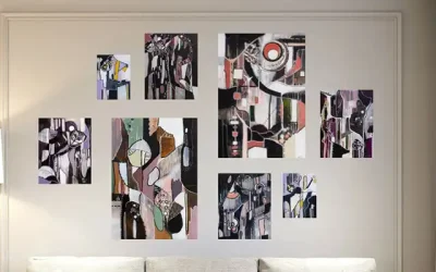
Five creative arrangement styles for artwork on your walls. Get to know different ways of hanging art and designing your walls. From classic to experimental.
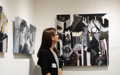
What a visit to an art fair or exhibition brings: as an artist to offer his art and as an art lover to buy exclusive works of art.

Various signs that it’s time to consider buying a work of art. When is the best time to buy art and why you might need a work of art to fulfill your wishes.

Find the perfect art to give as a gift to art-loving friends and family. Tips on how to choose a work of art to give as a gift.